Create a theme
Web AppBuilder provides out-of-the-box themes. Use the Demo theme that comes with Web AppBuilder as an example of how to develop a theme.
The Demo theme has one panel, one widget, two styles, and two layouts as described in the following list:
- The panel is called SimpleBorderPanel and has a basic border.
- The two styles are called default and black. The main color of the default style is red, and the main color of the black style is black.
- The two layouts are called default and right. The default layout places a widget on the left side of the screen, and the right layout places a widget on the right side of the screen.
 Note:
Note:
- The source code of the Demo theme is in the client/stemapp/themes/DemoTheme folder. You can use the Demo theme from within the Web AppBuilder GUI. By default, it is disabled. To enable it, open the .repoignore file in client\stemapp\themes, remove DemoTheme from the file, and restart the node server.
- Once you've created a custom theme, you can move the theme folder to any themes repository folder (client/stemapp/themes by default).
Create files for the theme
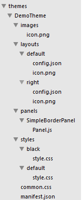
As described above, to create a theme, you need to create the necessary files under the theme folder. The following is the file structure for the Demo theme:
 |
Edit the manifest.json
The manifest.json file describes the theme’s content, and the builder reads this file to get the theme’s content. Based on the specification described above, update the manifest.json file as follows:
{
  "name": "DemoTheme",
  "panels": [
    {
      "name": "SimpleBorderPanel",
      "description": "This is a panel with a border"
    }
  ],
  "styles": [
    {
      "name": "default",
      "description": "this is default style",
      "styleColor": "red"
    },
    {
      "name": "black",
      "description": "this is black style",
      "styleColor": "#000000"
    }
  ],
  "layouts": [
    {
      "name": "default",
      "description": "this is the left layout"
    },
    {
      "name": "right",
      "description": "this is the right layout"
    }
  ],
		"platform": "HTML",
  "version": "0.0.1",
  "author": "Esri R&D Center Beijing",
  "description": "",
  "copyright": "",
  "license": "http://www.apache.org/licenses/LICENSE-2.0",
  "wabVersion": "1.1"
}
Create the panel
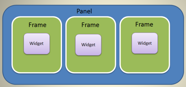
A panel is a UI element used to display the widget’s content. Multiple widgets can use the same panel. However, the widget does not display directly on the panel. It is put in the WidgetFrame, and the widget frame displays on the panel. One widget frame holds one widget, and one panel can contain more than one widget frame. The following image gives you a general idea of the relationships of the panel, widget frame, and widget.
 |
Developing a panel is the same as developing a web component, which requires JavaScript, CSS, and HTML skill and knowledge. It is also beneficial to understand the dojo's layout concept and practice.
To create a panel, you need to create a class that derives from BaseWidgetPanel. If the default widget frame meets your requirements, create a frame class that derives from BaseWidgetPanel.
Life cycle functions
Just as with widget development, there are life cycle functions that you can override to interact with the AppBuilder framework.
You can override the following functions when you create a panel:
- createFrame—This function returns the widget frame object.
- reloadWidget—This function is called by the builder when the widget is modified.
The following life cycle functions are the same as the widget's:
- onOpen
- onClose
- onMaximize
- onMinimize
- onNormalize
- onActive
- onDeactive
- setPosition
Create SimpleBorderPanel
Because the SimpleBorderPanel is very basic, extend the BaseWidgetPanel without adding any new features. See the following code:
define(['dojo/_base/declare',
  'jimu/BaseWidgetPanel'
],
function(declare, BaseWidgetPanel) {
  return declare([BaseWidgetPanel], {
    baseClass: 'jimu-widget-panel jimu-border-panel',
  });
});
For more information about panels, see BaseWidgetPanel.js file in the client/stemapp/jimu.js folder.
Create the styles
You need to write some style (CSS) files to make the theme more attractive and have a consistent UI. In the style files, you can override the styles in jimu.css, and write the styles that your panel needs as well. Place the common styles (used by all of the styles) in the common.css file and the specific styles in the corresponding style.css files.
There should be a style named default, which is used by default from within the AppBuilder GUI.
Edit the default styles
Because the default style’s main color is red, use the following style:
.jimu-border-panel{
  border: 1px solid red;
}
Edit the black style
.jimu-border-panel{
  border: 1px solid black;
}
Create the layouts
A layout is a config template file. Although it uses the same format as the app’s config file, it may contain only a subset of the properties. For example, the default layout may contain the following:
- widgetOnScreen—Includes all of the properties
- map—Includes only the position property
- widgetPool—Includes all of the properties
In the default layout, you can define on-screen widgets with the URI and position properties, or with the position property only. A widget with only the position property is called a placeholder, which allows you to add a widget during configuration.
For the non-default layouts, you can only define the position of the widget and group with either array or object as described in the following:
- With array, you must define the position of the widget and group one by one.
- With object, you can use the widget's URI as a key and position as a value to define the position. For the placeholder widget, since it has no URI, use ph_<i> as the key, where the <i> is the index of the placeholder. For the group, use g_<i> as the key, where the <i> is the index of the group.
In addition, you can define the layout that runs in the mobile app with the mobileLayout property. See the mobileConfig file in the App configuration reference.
When switching the layout from A to B, the positions defined in layout B automatically overrides the positions defined in layout A by the app container.. If the widget or panel's position is not defined in layout B, use layout A instead.
Finally, there should be a layout named default. This layout is used by default when the theme is selected in the AppBuilder GUI.
Edit the default layout
{
  "widgetOnScreen": {
    "panel": {
      "uri": "themes/DemoTheme/panels/SimpleBorderPanel/Panel"
    },
    "widgets": [{
      "uri": "widgets/Scalebar/Widget",
      "position": {
        "left": 25,
        "bottom": 25
      },
      "version": "1.2"
    }, {
      "uri": "widgets/HomeButton/Widget",
      "position": {
        "left": 7,
        "top": 75
      },
      "version": "1.2"
    }, {
      "uri": "widgets/Coordinate/Widget",
      "position": {
        "left": 200,
        "bottom": 20
      },
      "version": "1.2"
    }, {
      "uri": "widgets/BasemapGallery/Widget",
      "position": {
        "left": 45,
        "top": 5,
        "width": 430,
        "height": 410
      },
      "version": "1.2"
    }, {
      "position": {
        "left": 95,
        "top": 5,
        "width": 400,
        "height": 410
      }
    }, {
      "uri": "widgets/ZoomSlider/Widget",
      "visible": true,
      "position": {
        "top": 5,
        "left": 7
      },
      "version": "1.2"
    }]
  },

  "map": {
    "position": {
      "left": 0,
      "top": 0,
      "right": 0,
      "bottom": 0
    }
  }
}
Edit the right layout
{
  "widgetOnScreen": {
    "widgets": [{
      "position": {
        "left": 25,
        "bottom": 25
      }
    }, {
      "position": {
        "left": 7,
        "top": 75
      }
    }, {
      "position": {
        "left": 200,
        "bottom": 10
      }
    }, {
      "position": {
        "left": 45,
        "top": 5,
        "width": 430,
        "height": 410
      }
    }, {
      "position": {
        "right": 95,
        "top": 5,
        "width": 400,
        "height": 410
      }
    }]
  }
}
Edit the main.js file
The main.js file loads and runs when the theme loads. You can put the initialization codes in it or keep it like this: define([], function(){ });
Add i18n support
Your theme may contain some strings that you want to internationalize. Similar to the widget, you can create the string.js file in the nls folder. Refer to Add I18n support under widget development. You can also internationalize display names associated with a theme, such as _themeLabel for the theme display name, _layout _layout_[layout name] for the layout display name, and _style[style name] for the style display name.
Support RTL
There are some languages that read from right-to-left (RTL). In these languages, the app's layout should be right-to-left as well. The apps created from Web AppBuilder provide the following features for RTL support:
- The position property configured in the app config.json file is mirrored automatically in RTL languages. For example, when the left of position property is set to 10, it is changed to the right with 10 in RTL languages.
- Programmatically you can use CSS classes in jimu.js/css/spacing.css. When these CSS classes are applied, the page layout is changed to RTL in RTL languages.
- The jimu-rtl class is added to the html tag. Use this class as a CSS selector to write CSS rules for RTL languages.
- There is a global JavaScript variable, isRTL. It is automatically set to true in RTL languages.
- Each layout has an icon named icon.png. In RTL languages, you must provide a different icon and name it icon_rtl.png.
Create a theme widget
Creating a theme widget is the same as creating a normal widget except for one additional property, isThemeWidget. This property is defined in the manifest.json file and should be set to true. The theme widget is located in the \theme name\widgets folder.
Try the Demo theme in the builder
Once you place the Demo theme in the themes folder, start the AppBuilder and create a new app. The Demo theme shows on the Themes tab.
- Click the Demo theme.
- Click the Layout icon to switch layouts.
- Open the BasemapGallery widget.
- Click the style icon to switch styles.
During development, use http://your host/webappbuilder/?id=stemapp to access your theme directly.
Best practice to create a theme
- Use an appropriate name and icon for a theme.
- Create more than one style and layout so users have options.
- Put the panel’s CSS in the panel’s folder to make copying and reusing the panel easy.
- there is no need to override all the classes in jimu.css and jimu-theme.css. Just override what you need.
- Create more placeholders in the layout so that users can have options when configuring the app.
- Consider how the theme looks on mobile devices when designing the theme. appInfo.isRunInMobile, a JavaScript global variable, and jimu-ismobile, a CSS class, are provided to help you develop a responsive theme. You can also use the mobileConfig property to define the layout on mobile devices.