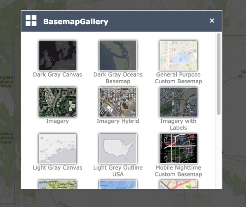
Create a new panel
Create a modal panel to grab your user's attention on a critical step in your app. This can include alerting a user of a task that must be completed or to save important data. A modal view typically includes completion and cancel buttons that exit the view.
Create a new panel widget folder structure
Learn how to create the folder structure for your new modal panel.
-
Browse to the ~/client/stemapp/themes/YourTheme/panels folder and create the ModalPanel folder with the following structure:
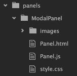
- Register ModalPanel in the panels section in the manifest.json file.
{ "name": "ModalPanel", "description": "This is a panel that appears as a modal dialog" } - Import the panel’s style.css file in common.css.
@import url("panels/ModalPanel/style.css");
Set the HTML template in Panel.html
Below is the HTML template for the panel.html file that is in your folder structure.
- Open the Panel.html file from the ~/client/stemapp/themes/ YourTheme /panels/ModalPanel/Panel.html folder.
- Paste the following HTML structure that contains a title panel and a content panel into the Panel.html file:
<div>
  <div>
  <div class="jimu-panel-title" data-dojo-attach-point="titleNode">
    <div class="widget-icon">
      <img data-dojo-attach-point="titleIconNode"/>
    </div>
    <div class="title-label" data-dojo-attach-point="titleLabelNode">
    </div>
    <div class="close-icon jimu-float-trailing" data-dojo-attach-point="closeButtonNode"></div>
  </div>
  <div class="jimu-panel-content" data-dojo-attach-point="containerNode"></div>
</div>
Note:
Note:Some of the class names are taken from the Jimu CSS framework, which provides a set of predefined CSS styles.
Add minimal required code to Panel.js
Add some code to your new js file so it functions as expected.
- Open the Panel.js file from the ~/client/stemapp/themes/ YourTheme /panels/ModalPanel folder.
- Copy and paste the following code into the Panel.js file:
define(['dojo/_base/declare',
  'jimu/BaseWidgetPanel',
  'dijit/_TemplatedMixin',
  'dojo/text!./Panel.html'
],
function(declare, BaseWidgetPanel, _TemplatedMixin, template) {

  return declare([BaseWidgetPanel, _TemplatedMixin], {
    templateString: template,
    baseClass: 'jimu-panel jimu-modal-panel',

    postCreate: function() {
      this.inherited(arguments);
    },

    startup: function() {
      this.inherited(arguments);
    }
  });
});
The following classes are required:
- jimu/BaseWidgetPanel—The base class for a panel widget. It is located at ~/client/stemapp/jimu.js.
- dijit/_TemplatedMixin—A Dojo mixin to compose a widget that takes an HTML template to create its DOM tree. See Create template-based widgets for more information.
Set the panel position
The ModalPanel widget has a default width of 450 pixels and height of 400 pixels, and it is placed in the center of the screen. If a position property is set in the layout configuration associated with ModalPanel, it overrides the default position properties.
- Open the Panel.js file and add a new widget attribute DEFAULT_POSITION with a width property of 450 pixels and a height property of 400 pixels.
... baseClass: 'jimu-panel jimu-modal-panel', DEFAULT_POSITION: { width: 450, height: 400 }, ... - Add a new method named _setPosition.
_setPosition:function() { } - Read the position configuration for the panel.
_setPosition: function() { var positionConfig = this.config.panel.position; } - Add code snippets to do the following:
- Use the default width if the width is not defined.
- Use the default height if the height is not defined.
- Horizontally center the panel if both the left and right properties are not defined.
- Vertically center the panel if both the top and bottom properties are not defined.
_setPosition: function() { var positionConfig = this.config.panel.position; if (!positionConfig) return; // use default width if no width is set if (!('width' in positionConfig)) { this.domNode.style.width = this.DEFAULT_POSITION.width + 'px'; } // use default height if no height is set if (!('height' in positionConfig)) { this.domNode.style.height = this.DEFAULT_POSITION.height + 'px'; } // horizontally position the panel in the center // if no left and right properties are set if (!('left' in positionConfig || 'right' in positionConfig)) { this.domNode.style.left = '50%'; this.domNode.style.marginLeft = -this.DEFAULT_POSITION.width * 0.5 + 'px'; } // vertically position the panel in the center // if no top and bottom properties are set if (!('top' in positionConfig || 'bottom' in positionConfig)) { this.domNode.style.top = '50%'; this.domNode.style.marginTop = -this.DEFAULT_POSITION.height * 0.5 + 'px'; } } - Call the _setPosition method in startup().
startup: function() { this.inherited(arguments); this._setPosition(); }, - In the layout config.json file, use ModalPanel as the default panel for the widget pool without defining its position property.
"widgetPool": { "panel": { "uri": "themes/DemoTheme/panels/ModalPanel/Panel" } } - In ArcGIS Web AppBuilder, create a new app, and select the theme that has the ModalPanel widget. Click the widget you added from the widget pool.
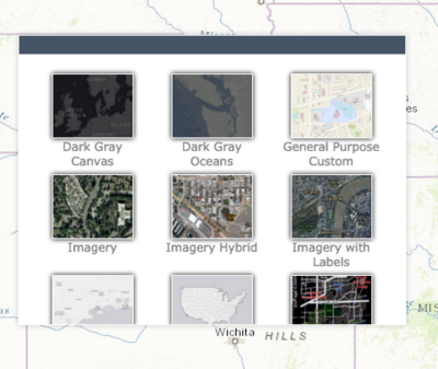
It should be wrapped in a modal panel and displayed in the center of the screen as shown below.
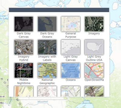
- Add position properties to ModalPanel in the layout config.json file as shown in the following example:
"widgetPool": {
  "panel": {
    "uri": "themes/DemoTheme/panels/ModalPanel/Panel",
    "position": {
      "top": 50,
      "bottom": 0,
      "width": 650,
     "zIndex": 101
    }
  }
}
The panel should honor these properties.
Create the title pane
The widget icon, its name, and a close button are added to the title pane in this section.
- Create a new method named _initTitlePane in the Panel.js file.
_initTitlePane: function() { } - Get the app’s config file.
_initTitlePane: function() { var appConfig = this.config; } - Populate the icon and label in the title pane.
_initTitlePane: function() { var appConfig = this.config; if(!appConfig) return; // add icon if(appConfig.icon) { this.titleIconNode.src = appConfig.icon; this.titleIconNode.alt = appConfig.icon; } else { this.titleNode.removeChild(this.titleIconNode.parentNode); } // add label if(appConfig.label) { this.titleLabelNode.innerHTML = appConfig.label; } else { this.titleNode.removeChild(this.titleLabelNode); } } - Attach the close button node to an onclick event handler in the _initTitlePane method, and make a call to the closePanel method from the panelManager instance provided by jimu/BaseWidgetPanel to close the panel.
_initTitlePane: function() {
  ...
  // close button event handler
  var self = this;
  this.own(on(this.closeButtonNode, 'click', function() {
    self.panelManager.closePanel(self);
  }));
}
Note:
Note:The dojo/on is to attach the onclick event. Make sure this class has been included in the class declaration.
- Add the following styles to the style.css file in the ModalPanel folder:
- Align elements in the title pane properly.
- Use an image as the background image of the close button.
An image named x.png is added to the ~/client/stemapp/themes/YourTheme/panels/ModalPanel/images folder. Use any image as the close icon.
.jimu-modal-panel .jimu-panel-title { padding: 10px; } .jimu-modal-panel .jimu-panel-title > * { display: inline-block; vertical-align: middle; } .jimu-modal-panel .widget-icon { margin-right: 10px; } .jimu-modal-panel .widget-icon img { height: 24px; } .jimu-modal-panel .close-icon { width: 24px; height: 24px; background-image: url('images/x.png'); background-repeat: no-repeat; background-position: center center; cursor: pointer; } - Call the _initTitlePane method before _setPosition in startup():
startup: function() {
  this.inherited(arguments);
  this._initTitlePane();
  this._setPosition();
},
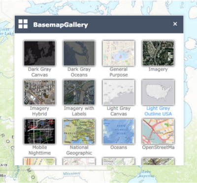
Your result will look similar to the following:
Add an overlay element
Add a DOM element that covers the entire screen when the panel is open.
- Add a new method named _toggleOverlay in the Panel.js file to show or hide the overlay. Also add logic to add or remove a DIV element under the panel.
_toggleOverlay: function(isShow) { // create overlay if(!this.overlayNode) { this.overlayNode = document.createElement('DIV'); this.overlayNode.className = 'jimu-modal-panel-overlay hidden'; if(this.domNode.parentNode) { this.domNode.parentNode.insertBefore(this.overlayNode, this.domNode); } } // add/remove class 'hidden' to/from the overlay if(isShow) { domClass.remove(this.overlayNode, 'hidden'); } else { domClass.add(this.overlayNode, 'hidden'); } } - Add a method named onOpen to extend the method in the jimu/BaseWidgetPanel class. It will be called when the panel is opened. Call the _toggleOverlay method and pass true as its argument.
onOpen: function() { this.inherited(arguments); this._toggleOverlay(true); }, - Add a method named onClose to extend the method in the jimu/BaseWidgetPanel class. It will be called when the panel is closed. Call the _toggleOverlay method and pass false as its argument.
onClose: function() { this.inherited(arguments); this._toggleOverlay(false); }, - Add CSS styles to the style overlay node in the style.css file.
.jimu-modal-panel-overlay {
  position: absolute;
  top: 0;
  left: 0;
  width: 100%;
  height: 100%;
  background: #000;
  opacity: 0.65;
  z-index: 101;
}
.jimu-modal-panel-overlay.hidden {
  display: none;
}
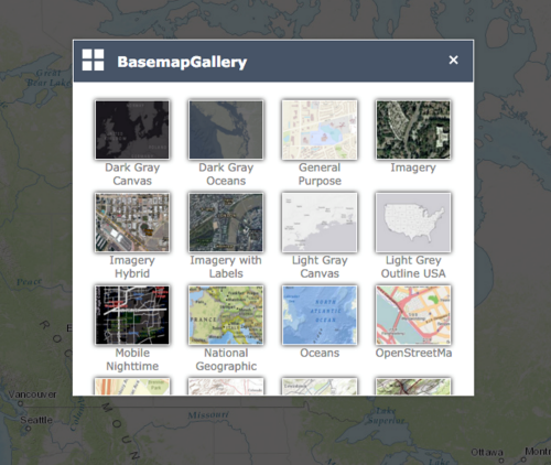
Your result will look similar to the following:
Configure the content pane to fill remaining space
The content pane does not fill the remaining space after the title pane, and the content of the widget can be cut off when it is too long. In this section, you'll position the content pane to automatically fill the remaining space.
- Use the absolute position for the content pane in CSS. Open the style.css file and add the following styles:
.jimu-panel-content {
  position: absolute;
  width: 100%;
  top: 0;
  bottom: 0;
  overflow: auto;
}
Note:
Note:You can also use other methods to accomplish this, such as flex box, or calc() in CSS.
- Create a new method named _repositionContent.
_repositionContent: function() { } - Add the following code to calculate the distance between the top of the content pane and the top of the ModalPanel widget’s DOM node (this number equals the height of the title pane). Set the number to the top property in the content pane’s style.
_repositionContent: function() { var newTop = this.titleNode.clientHeight; this.containerNode.style.top = newTop + 'px'; } - Call _repositionContent in the onOpen method.
onOpen: function() {
  this.inherited(arguments);
  this._toggleOverlay();
  this._repositionContent();
},
The content pane uses all available space in the ModalPanel widget, and the scroll bar appears.
Your result will look similar to the following:
