3DFx widget
The 3DFx widget provides you with a collection of 3D animation approaches to visualize and analyze geographic information in an intuitive and interactive 3D environment. Currently, the widget supports the following six visualization types in both global and local scenes:
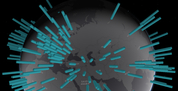
- Point Extrusion—Uses cylinders to display a point feature layer
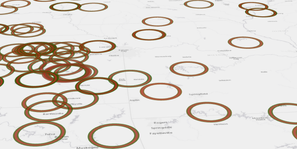
- Pulse—Uses circles to display a point feature layer
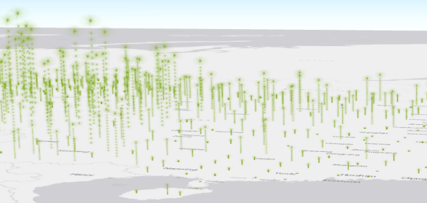
- Bounce—Uses glowing balls on top of dashed lines to display a point feature layer
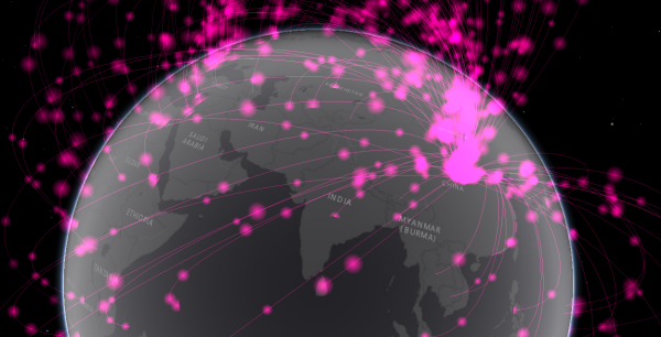
- Fireball—Uses flying, glowing balls to display a polyline feature layer
- Jet Trail—Uses flying, glowing balls with tails to display a polyline feature layer
- Area Extrusion—Uses boxes to display a polygon feature layer
Configure the 3DFx widget
-
Under Visualization Settings, choose the visualization
type (see details in the Visualization Types section) from the drop-down menu.
- Point Extrusion uses a cylinder to display a point feature layer. The height of the cylinder represents the value of the visualization field. The larger the value, the taller the cylinder. The Max Symbol Height option controls the height of the cylinder with the highest value. The Max Symbol Width option controls the radius of all cylinders. After the widget is activated, the cylinders gradually extrude from the ground and stop when they reach the maximum height.
- Pulse uses circles to display a point feature layer. The radius of a circle represents the value at its centroid location. The higher the value, the larger the circle. The Max Symbol Width option controls the radius of the circle with the highest value. After the widget is activated, the circles continuously expand to their largest radius and repeatedly shrink.
- Bounce uses glowing balls on top of dashed lines to display a point feature layer. The height of the dashed line and the radius of the glowing ball both represent the field value at their point location. The higher the value, the larger the glowing ball. The Max Symbol Height option controls the height of the dashed line with the highest value. After the widget is activated, the balls continuously bounce up to their maximum heights and repeatedly return to the ground.
- Fireball uses flying, glowing balls to display a polyline feature layer. For a line feature, an arc is created to connect the start node and the end node of this feature, and a set of balls fly along this arc to represent the value of the field. The higher the value, the larger the ball. The Max Symbol Height and Max Symbol Width options are disabled for this type. After the widget is activated, the balls continuously fly from the start node to the end node.
- Jet Trail uses flying, glowing balls with tails to display a polyline feature layer. For a line feature, a glowing ball with a tail jumps from the start node to its end node to represent the value of the field. The higher the value, the larger the ball. The Max Symbol Height and Max Symbol Width options are disabled for this type. After the widget is activated, the balls continuously jump from the start node to the end node.
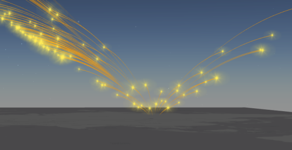
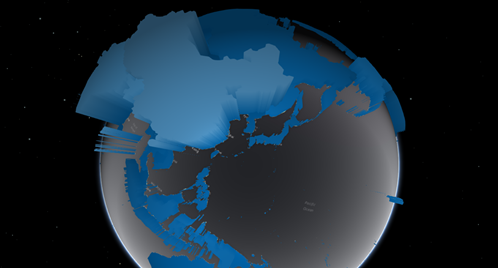
- Area Extrusion uses boxes to display polygon feature layers. For a polygon feature, a box extrudes from the ground to its maximum height to represent the value of the selected field. The higher the value, the taller the box. The Max Symbol Height option controls the height of the box with the highest value. After the widget is activated, the boxes gradually extrude from the ground and stop when they reach their maximum heights.
 Tip:
Tip:Depending on the type of visualizations, you can change certain size parameters for symbols. For Bounce, you can set Max Symbol Height only. For Point Extrusion, you can set both Max Symbol Height and Max Symbol Width. For Pulse, you can set Max Symbol Width only. For Area Extrusion, you can set Max Symbol Height only.
Regardless of the selected visualization type, the default Max Symbol Height and Max Symbol Width are both 2,000,000 meters.
Because these symbols are in real-world units, they are drawn by a constant size regardless of the view distance. As a result, you need to adjust the symbol properties to display the data appropriately. In general, the default values are best suited for features displayed at a global scale. If the features are located at a small scale, for example, within a city, measuring the extent and the gaps between features beforehand will help find the suitable symbol sizes for them.
- Point Extrusion uses a cylinder to display a point feature layer. The height of the cylinder represents the value of the visualization field. The larger the value, the taller the cylinder. The Max Symbol Height option controls the height of the cylinder with the highest value. The Max Symbol Width option controls the radius of all cylinders. After the widget is activated, the cylinders gradually extrude from the ground and stop when they reach the maximum height.
- Optionally, you can turn Show values as percentage of all values on or off for a visualization field specified in step 6 if the selected feature layer includes 400 or fewer records. If the selected feature layer includes more than 400 records, Show values as percentage of all values will remain unchecked.
- Uncheck Automatically Change Colors, and the symbol color of the visualization in the scene will use the color of the selected theme. You can change the symbol color by choosing a color from Style on the Theme tab. If it is checked, the symbol color of the visualization is automatically changed when there is more than one visualization field.
- If applied, define the maximum symbol height and width in meters as well as the interval in milliseconds to automatically change colors per field.
- Under Layer Settings, choose the visualization layer, and display a field from the drop-down menu.
- Click Add Visualization Field and choose a visualization field from the drop-down menu. Optionally, add more visualization fields. Provide a display label for each visualization field. You can also sort or remove the fields.
Use the 3DFx widget
- Click the widget and a pane appears at the bottom of the app, displaying a visualization field value for features on the scene. Click the horizontal slider to see the rest of the values. With a point feature layer, click a card to navigate to its corresponding point location on the scene.
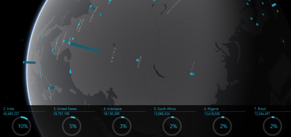
- With a global scene, click the Start or Stop button next to the display field name to change the rotation status of the scene.
- Click the Start or Stop button next to the display field name to change the rotation status of the scene.
- Click the Visualize other fields button
 to visualize other fields in the scene.