Group Filter widget
The Group Filter widget allows you to apply filters to one or multiple layers in the map. The layers can be grouped into a logical filter set. Each set can have a predefined value to facilitate user interaction.
Configure the Group Filter widget
This widget can be set to open automatically when
an app starts. Hover over the widget and click the Do not open this widget when
the app starts button  to change the setting to Open this widget automatically when the app starts. (For widgets that you need to add to the app first, you can turn on this option after configuring the widget.)
The following steps indicate how to create a filter set. Repeat these steps if you need to define additional filter sets.
- Hover over the widget and click the Configure this widget button
 to open the configuration window.
 Note:
Note:If you need to add the widget to the app first, click a widget placeholder on the Widget tab. In the Choose Widget window that opens, select the widget and click OK.
- Optionally, click Change widget icon to replace the default icon for this widget. A file explorer window appears, allowing you to choose a local image file to use as the widget icon.
The configuration displays with one filter group that's ready to modify.
- Define filter groups:
- Group Name—Provide a name for this filter group. It will be displayed in the drop-down of available filter groups.
- Description—Optionally, you can provide a description to guide users on what this group filters.
- Preset Operator—Optionally, select a default operator to be used for this filter group. The end user can change the selected operator before applying the filter. If none is selected, the filter uses the EQUALS operator by default.
- Preset Value—Predefine a value for this filter so the end users do not have to supply this criteria. You have the option to type a value or click the search button to choose a value from an existing layer. This value is used to filter across all the layers defined in the filter group.
- When a layer is listed more than once—If a layer is listed more than once in a filter group and the filter is applied on different fields, you can control how these fields are joined by choosing to match any or all expressions.
- Match any expression—The filter result will return features where any of the field values match the expression defined for this filter group.
- Match all expressions—The filter result will return only features where all the field values matched the expression defined for this filter group.
- Perform a case sensitive search—Check the box to only return features with attribute values that exactly match the search input with uppercase and lowercase characters.
- In the provided table, a layer and field are selected randomly from your map to get you started with an example. Customize the layers and fields to which you want to apply a filter.
- Layers—The name of the layer as defined on the map. Select a layer from the map using the drop-down.
- Fields—The field that the layer will be filtered on. Select a field from the layer using the drop-down.
- Use Value—Option to use the values from this layer and field in a drop-down, as a list f value options to filter. If this parameter is not enabled for a layer, an empty text box appears for the user to type a custom value. This setting is optional.
- To add another layer to this filter group, click the Add Layer button.
- To add another filter group, click the Add a New Group button. If needed, repeat steps 3 through 5.
- Specify a custom header text for the widget using the Provide text to display above filter selection text box.
- The following six check boxes control the way the widget behaves:
- Start in simple view—Determines how the widget will appear to end users. Checking this box hides the operator drop-down list and the Add Criteria button from the interface, giving it a more basic appearance.
- Hide the widget options—Determines whether to hide the icon, exposing additional widget settings. These settings include saving and loading defined filters, appending to an existing filter definition in the map if it exists, and persisting the filter even after the widget is closed.
- Append any/all expressions to existing map filter—If the web map has an existing predefined filter applied, this setting allows you to add filters created in this widget to the existing web map filter. This setting will persist filters across multiple groups. If unchecked, the widget will override the web map filter.
- Using any is additive; the configured filter is added to the web map filter.
- Using all is exclusive; only display features that meet both the requirements from the configured filter and the web map filter.
- Zoom to result—Determines whether to zoom the map to the extent of the filtered data. By default, the map maintains its current extent.
- Persist filters after widget is closed—Allows you to persist the applied filters when the widget is closed. By default, filters are cleard from the map when the widget is closed.
Hide the header and filter (for single filter group)—Allows you to hide the header and filter group drop-down menu when only one group is configured.
Use the Group Filter widget
Complete the following steps to use this widget.
- Click the Group Filter widget to display a selection of predefined filter groups.

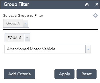
Two drop-downs appear below the line divider: operators and values. In the example, the map is filtered to show only abandoned motor vehicle complaints.
 Note:
Note:Depending on how the layers are configured in the widget, you will either see a values list (similar to the one in this example), a text box for user input, or a date picker.
- Click Apply to apply the filter to the map.
Optionally, you can apply filters by adding parameters to the app's URL. The URL must be in the following format—replace the variables in angle brackets with the values described in the list below:
https://<your portal URL>/apps/webappviewer/index.html?id=<Item ID>&groupfilter={"<Filter Set Name>":["<value>","<value>",...]}- Item ID—The unique ID of the app.
- Filter Set Name—The defined name for the filter group. This value is case sensitive.
- Value—The value used to perform the filter. To filter based on domains, use the domain code.
For example, to apply the filter shown in the preceding image, you'd use a URL similar to the following sample:
https://<your portal URL>/apps/webappviewer/index.html?id=6815e148ff1c4aee8dc7159816380a4d&groupfilter={"Group A":["Abandoned Motor Vehicle"]} Note:
Note:If the Group Filter widget isn't configured to open automatically when the app starts, the filter defined in the URL won't apply until you open the widget.
- Click Reset to remove the filter and restore the map layers to their initial state. (By default, closing the widget also removes the filter.)
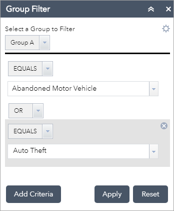
- The widget allows you to add additional filter criteria at run time. Click Add Criteria to add another clause. Notice that the two criteria are joined with a conjunction. You can choose to join them using OR or AND.

To use URL parameters to apply the filter shown in this example, your URL would look like the following sample:
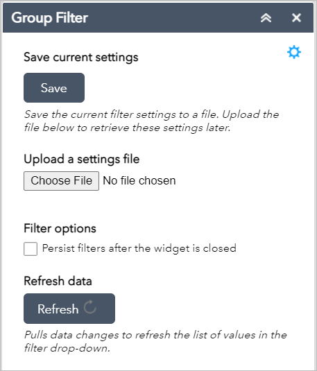
https://<your portal URL>/apps/webappviewer/index.html?id=6815e148ff1c4aee8dc7159816380a4d&groupfilter={"Group A":["Abandoned Motor Vehicle","Auto Theft"]} - Unless the setting to Hide the widget options was checked in the widget configuration, you can save these defined criteria settings for future use. Click the settings button
 to access the options panel.
- Click the Save button to save the current filter settings locally into a JSON text file.
- Click Choose File under Upload a settings file to load a previously saved JSON text file to restore all the criteria defined in the file.
- If you need to use the filtered map in other widgets, check Persist filters after the widget is closed. Otherwise, closing the widget will remove the filters applied to the layers in the map.
- Click the Refresh button to pull the data changes from the layers in the map and refresh the list of values in the filter drop-down. This may be needed if the layers being filtered were edited during the current app session, which may have affected the list of available values.